You are currently browsing the tag archive for the ‘Telenor’ tag.
I like takeovers. Yes i do, beacause most of the times they are entertaining and therefore the creative itself is a valuable content for visitors. I think the biggest difference between interstitials and takeovers are this: takeovers can be entertaining while interstitials are more like big unavoidable – mainly image – adverts (unless you disable flash content in your browser). However you may find many more examples for interstitials while browsing. That’s because takeovers requires more creative work and co-ordination. Unfortunately, the tight deadlines and sometimes the lack of experience with such a complex creatives does not favor to the wide use of takeovers.
Djuice as a brand of Telenor targeting teens and young adults. Djuice likes using not-everyday solutions and do spend a lot on online marketing communication as its target audience can be reached via online easily.
Their newest campaign is about promoting multimedia mobile services. Hungary in the CE region is an early adaptor of new mobile functions. The biggest barrier is financing the cost of new services as the biggest part of early adaptor target audience belong to the teen and young adults age group.
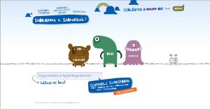
So Djuice came up with a promotion of giving back a weekly cost in every month for new subscribers. They created a microsite for the promotion that supports the message by funny modern artistic characters monsters:
This graphical world is really close to these days’ most popular animation series. But, let’s see the creative that directs the microsite:
The takeover was published on Hotdog.hu, the most popular Hungarian community portal. There is a fake Hotdog opening page that looks like the real one and as the portal loaded monsters appear and conquer the whole screen. The total animation lasts for 12 seconds which is the the time limit of overlay solutions. They should automatically disappear after 12 seconds. Here I have a problem. For such a special overlay creative there should be a following ad because if the visitor is watching what’s happening and suddenly ends but cannot be recalled because one visitor can see it only once per week (there is a weekly cookie) there should be a small reminder later. Otherwise they loose the users that don’t switch in 12 seconds.
I like the creaive idea: Make fun with words. Even though they don’t cover the whole story (we are talking about multimedia content that also includes pictures, videos, music, etc.) I think the creative execution is good. I think Hotdog as a medium was a right choice. It has its own look and feel very similar to the key visuals of the campaign.
And what about the link in between the message and the product? The microsite is as nicely done as the campaign creative. What I am missing still is the connection between the visuals and the offer. I know that there are strict guidelines how to visualize the product and price offer but I would see the monsters on the product offer page presenting maybe. Without keeping them on that page these offers are too direct and tells the visitor that make no mistake this is what is important for us (for the company): selling the phones. Some might not think about that but this nuisance may negatively affect the optimal results.
Pros:
+ good creative idea
+ nice creatives
+ creative mediaplanning
Contras:
– missing follow up of takeover creative
– missing visual link between the creative and the message on the microsite
I would be glad to see such well-done campaigns on the Hungarian market. It was inspiring.


Recent Comments